VOBILE
Combating voter suppression with Voting Gone Mobile.

Work Details
Role
Type
Time Frame
UX Designer & Researcher
UX Design | Mobile | Personal Project
Aug 2020 - Sep 2020
Figma, Whimsical, Invision
Tools
Design Problem
How might we overcome voter suppression?
While the right to vote is supposed to be protected for all adult US citizens, the reality is that voter suppression deprives many voters, particularly minorities, of an ability to voice their values, opinions and desires for change in politics that deeply impact their lives.
Below is just some of the research I complied to understand the many manifestations of voter suppression and who it impacts.
.png)
.png)
Ideation
Narrowing the application's scope & identifying intended users
After this research, I narrowed my goals to fighting voter suppression and reducing specific, known barriers minorities face when voting. I identified my intended users as minorities who face voter suppression, to include people of color, the elderly, people with disabilities, and people of lower socioeconomic status. I wanted the application experience to create an environment that invoked feelings of safety, convenience and ease of use.
.png)
Created using Whimsical
With this in mind, I chose four forms of voter suppression to address. Accessibility was the common theme, with the dimensions of time, distance/location and accommodations for the elderly and people with disabilities.
.png)
Solution concept and application design
From this sprung the concept of VOBILE - Voting Gone Mobile.
Because physical distance and transportation can pose the biggest barriers for minorities to vote, I decided that the application would offer a mobile solution for in-person voting. I chose to create a solution for in-person voting because in many states where voter suppression is especially prominent, there are strict laws that limit minorities' ability to vote by mail, even during a global pandemic.
Like a mobile library, VOBILE will deploy a mobile polling station to neighborhoods where minorities live, My application enables voters to be matched with and reserve a voting day, time and location that is convenient for them. The only tool they need is a mobile phone, which is nearly ubiquitous in American households across all socioeconomic levels.
Below are my interaction flow chart and wireframe flow:
Interaction Flow Chart

Wireframe Flow

High Fidelity Prototype
Selecting a design tool
To create the high fidelity prototype for the app, I used Figma. This was my first time creating a prototype in Figma. I had used it for about a month to create graphics for my role as a Community Outreach Social Media and Graphics Liaison for my university chapter of the Society of Women Engineers.


Final Product
The first prototype below is the full experience of VOBILE starting with a user signing up until they are set with a voting date, time and location. The demo also shows the user inputing their availability for multiple dates and requesting special accommodations.
My user is a resident from Prairie View, Texas, a city that has a history of voter suppression. Despite being a city that has many black residents, Prairie View is situated in Waller County, which is predominately white. In 2018, students of Prairie View A&M University (a historic black university) filed a federal lawsuit against the county because of limited early voting options. Before the lawsuit, use of the university student center polling station was "restricted to three days of early voting, compared with two weeks in some other parts of the county - and two weeks at majority-white Texas A&M in a nearby county" (NYT, nytimes.com/2018/11/03/us/politics/voting-suppression-elections.html). After the lawsuit was filed, the county added "a single day of additional voting off-campus... and some additional hours on campus, but a top official said it did not have the resources or time to do more" (NYT).

I intentionally chose a color palette that had no political affiliations in the U.S., avoiding red and blue in the design. Instead, I selected a yellow-orange color because of its association with energy, aiming to revitalize users' hope in the voting process.
As with any application, there is more than one user flow. Here is the breakdown of the three different onboarding user experiences a voter has when first using VOBILE:

User Signs In
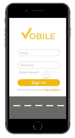
User Signs Up

Reset Password
Understanding and reflecting users' emotions
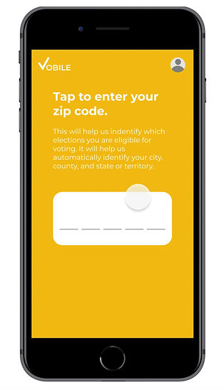
Voter information is often sensitive information. Users might feel reluctant to share personal information in an application, so I made sure that VOBILE always explains exactly how their data is being used.
For example, the app explains why VOBILE is asking for their zip code and how it will be used to determine which elections they are eligible for, based on their city, county, and state - all which can be determined by one's zip code.
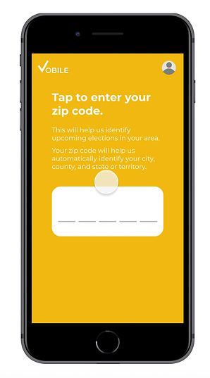
Entering Zip Code
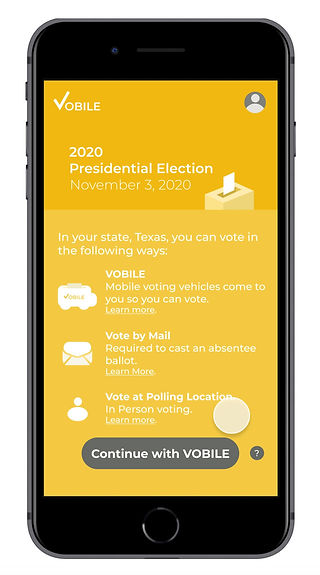
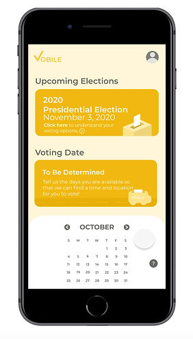
Experiencing voter suppression can make minority voters feel as though their options to exert their right to vote have been limited. With VOBILE, I wanted to create an environment of hope, showing them all of their voting options, with VOBILE being a newly added option. So I added a section breaking down all the ways a user can vote during an upcoming election. From there, users can confidently choose their preferred voter experience.
At this point, users are asked whether they want to proceed with using VOBILE as their voting method.

Making sure users know their voting options
It might take users multiple times to find a date and time that works for them, and that's okay. Sometimes the times and distance you can travel don't match up with where VOBILE vehicles will be located. To minimize frustration and keep users engaged in voting, I created three different options:
Option 1: Continue to input their availability through the calendar until they find a match.
Option 2: View a list of available voting times when VOBILE will be near them. If they think a time might work, they can add it to their queue and continue searching. If the time works, they can commit to the time on the spot.
Two of the pillars of the VOBILE experience are the ease and convenience of the voting experience. Just because a user can make a voting time doesn't means it's ideal. This is why I implemented a function for users to be able to add a date to their voting queue and continue to explore other times as well. The intent is that users shouldn't settle for anything less than the most convenient time possible.
Option 3: If there aren't any voting times available based on the location and dates they've selected, users are reminded of their other voting options, such as going to a polling station or voting by mail.
Users are likely to feel frustrated when VOBILE cannot find a match, so presenting them with the other options aims to keep them committed to voting another way.
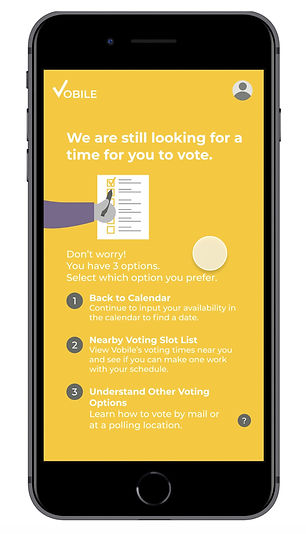


Option 1: Continue with calendar
Option 2: Other VOBILE time slots
Option 3: Other voting options
Explaining my design decisions
Accessible design & features
For this project, I wanted to make sure that the design and experience were accessible for users with disabilities. Thus, I prioritized ensuring that the voting process, as well as the features presented in the app, were accessible.
Addressing Color Blindness
First, I made sure that the color scheme was accessible. I used Adobe Color's recently added Accessibility Tools to test all of the color schemes in the app to ensure they were accessible for color blind users.
In the example below, the background and white container boxes I initially created conflicted with Deuteranopia, Protanopia, and Tritanopia. Modifying the lightest shade of yellow-orange created sufficient contrast with the white elements.

Before color blindness testing
After color blindness testing

Failed Color Blind Test (2 lightest shades of orange)

Passed Color Blind Test
Here are a few more examples of screen color schemes I tested and modified to be accessible:

Before
After

Before
After

Before
After
Addressing visual impairments
Next, I implemented a series of additional features to increase accessibility. At any point during their experience, users can simply click on their profile to turn on these settings:
1
2
3
Change Font Size
Enable Narration
Enable High Color Contrast
With the elderly as a user group for VOBILE, I implemented a draggable selector to increase or decrease the font size to improve readability.
When I first designed this feature, I was going to indicate the size change by percentage and use a plus/minus series of clickable buttons. I decided to use a draggable selector instead to maintain consistency across elements. This is because the next two features I am going to talk about are toggle switches. With the font size as a draggable button, users get the same visual indication of change through color change. The other reason for using the draggable button was that users could see the actual change in font size on the screen, rather than relying on a percentage to determine if the font is the size they desired.
The other two features I included were enabling a narrator for users who need (or prefer) to consume information through audio, and a feature to increase the contrast of the application to improve readability. While the application color scheme was already tested for color blindness, increasing color contrast of the screens can increase the readability for some users.

Adjusting Font Size

Enable Narrator
Ensuring accessibility after application use
In my initial research, I looked into the voting process for voters with disabilities. There are federal laws such as the VRA (1965, 1993), ADA (1990), VAEHA (1984), and HAVA that are in place to protect disabled peoples' right to vote. For example, VAEHA (Voting Accessibility for the Elderly and Handicapped Act, 1984) requires that polling locations are accessible for the elderly and disabled voters. HAVA (Help America Vote Act) ensures that a polling place have a minimum of one accessible voting system.
However, upon further research, I learned that disabled people often have to use curbside voting if the polling location's accessibility falls short. People have also reported problems voting due to the lack of preparedness of poll workers knowing how to operate accessible voting machines.
To improve the quality of the voting experience beyond what appears to be barely passing federal regulations, I wanted the VOBILE system to understand each individual user's needs to make sure that the resources needed are delivered as promised. Additionally, knowing whether a voter needs special accommodations can help VOBILE to plan and allocate resources so that there isn't a backlog of accessible voting machines. As with other voters, VOBILE aims to ensure that disabled voters do not have longer wait times than non-disabled users.
Accessibility in Voting
Removing repetition in user flow
Inputting your availability for every single day can be a long in tiresome process, especially if you don't find a match with a voting time early in the process. For this reason, I created a function to sync a user's email calendar to the app, VOBILE can quickly match voting slots to their calendar availability. This feature reduces friction in the process.

Syncing VOBILE with email calendar
Elements informed by usability testing
I conducted usability testing with three participants to identify aspects of the application that they found challenging.
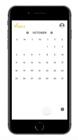
Date/Time Reordering
This research identified user difficulties with the scenario where participants were inputting multiple dates out of chronological order. For example, one user entered an available time in the evening of the date selected, then realized that they had an hour free in the morning as well.
Before usability testing, the dates were immediately reshuffled into chronological order, putting the newly added morning time above the afternoon time. However, usability participants found themselves looking towards the very bottom container, expecting to see a confirmation of the newly-added time slot there.
To ensure that this subconscious expectation was not disrupted, I redesigned this element to wait to reorder time slots by date and time once all information was entered.

Reordering dates
before usability testing

Reordering dates
after usability testing
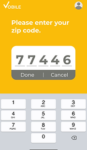
Submitting Zip Code
When I first created an element to identify the elections they were eligible for voting in, I had users select their state and input their county and city.
I decided to redesign this feature to have users only input their zip code. The app can automatically extract city, state and county information based on zip code, simplifying the process.
When I tested the application with users, I learned that my process for entering zip codes was not intuitive. In my original design, users had to tap the zip code space, enter numbers and tap the zip code space again to enter it. Other parts of my application used a similar tap, select, tap approach.
The primary difference was that the other elements had a select step in between the taps, but the zip code task required users to key in numbers. This data entry made the final tap in the process less intuitive. Users were unsure how to submit their zip code.
My solution was to provide buttons with the options to submit or cancel and reenter their zip code. With this approach, users no longer struggled to get past this stage of the VOBILE experience.

First version

Zip code entry
before usability testing
Zip code entry
after usability testing
Below are some of the design iterations I brainstormed when redesigning the Zip Code:

Attention to detail & consistency of features
Buttons & the order of actions
The leftmost button is a definitive action and the right is a lesser commitment. This makes it easier for users to automatically know where to look and which button to press - depending upon their intent.


Drag + click structure, so users can learn behaviors naturally
When behaviors are similar, it's easier for users to become accustomed to an application's functions. For VOBILE, I implemented a consistent set of features, using a drag up structure, each time users are making a decision.
Below are a series of sections in the VOBILE application that build off this fundamental behavior:
Dragging up: Calendar

Drag, Scroll & Click:
Choose final time

Drag and Select: Times
The last two of the three examples develop users' association with dragging and then clicking to finalize a time.
Seen below in shortened view:

Click to finalize voting time

Click to finalize time
Integrated help everywhere
While perhaps a standard feature in application design, I intentionally made sure that the help feature would be available throughout the application and be specific to the task users are doing on the screen.

Selecting times
Selecting dates
Reflection
This project gave me a deeper understanding of voter suppression, a topic that has always concerned me. I am lucky enough to live in a state and county where I do not experience these forms of voter suppression, but I recognize there are many citizens who are denied their right to vote by the very government that should be protecting it. This project allowed me to take a topic about which I am very passionate, and instead of having a defeatist attitude, I tried to think of a solution to make progress to overcome it.